Monday, June 10, 2013

Do You Know the Real Purpose of Graphics in Your Proposal?


Photo Courtesy of www.helpeverybodyeveryday.com

Recently, we came across a thought provoking blog from a fellow APMP member, Matt Handal in “The Purpose of Graphics and Images in a Proposal…It’s Not What You Think.”  He states that the “real purpose” of a graphic in your proposal is to get the proposal evaluator to read your text on the page.  “The letters and numbers in your proposal will make or break you.”  Handal suggests using headlines, images, and graphics as tools to pull the reviewer back to your message as no one wants to read too much text.  The graphic has to be "relevant and impressive” to pull the reader back to the text, time and again.  How does this blog change your views about adding graphics to your proposal or presentation? 

Wednesday, June 5, 2013

What's Next? How to Lie with 3D Charts and Replicas?


Photo Courtesy of www.Technologyreview.com

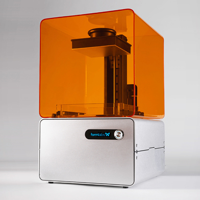
Formlabs has recently started to ship its Form 1 (3-D Printers) that will revolutionize 3-D media. At $3,299 it's cheaper than any other desktop 3-D printers out there today.  This may translate into further advances in engineering, product custom design, and any field that deals with mockups or prototypes for presentations. So what’s next?  How to Lie with 3D Charts and Replicas? (Admittedly, it's a facetious question.)  Formlabs is facing some patent infringement lawsuits, but those don't seem to have anything to do with flaws in the "printouts." Do you think having models for presentations will someday be as obligatory as bringing your PowerPoint slides?
http://www.technologyreview.com/news/515071/next-generation-consumer-3-d-printer-arrives-but-a-lawsuit-looms/

Sunday, June 2, 2013

Can the Average Person Make a Profit by Using Charts?


Photo Courtesy of Wiki Creative Commons

Gerald’s seminar “Pitfalls of Financial Charting” in Atlanta on May 29, 2013 was a resounding SUCCESS all around with a huge turnout!  In this seminar, he shows how charts can be a highly effective tool in finding and analyzing patterns in charts for financial market technical analysis.  Do you think that the visualization of mathematics' tools of using charts may help the average person become adept in the stock market to make a profit?

Monday, April 15, 2013

"Pitfalls of Financial Charting" Seminar at APMP 2013 Atlanta

Westin Peachtree Atlanta, Georgia - May 28 - 31, 2013


"Pitfalls of Financial Charting"

Day 2, Wednesday, May 29, 2:20 - 3:20pm

Seminar Presenter: Gerald Everett Jones, La Puerta Consulting

Conference Details click here


This seminar applies the principles Jones presented last year in "How to Lie with Charts" to the charting of financial results. His particular focus is on market technical analysis, but the wider implications of visual perception and interpretation bear on all aspects of creating clear communication, including proposal graphics.

To apply one of Murphy's Laws, "Technical analysis is a systematic method of coming to the wrong conclusion with high confidence." Participants will see how seemingly arbitrary choices about parameters and presentation modes can make all types of charts difficult to understand or even misleading. Relevant topics include separating signals from noise, axis manipulation, scaling, 3D effects, statistical analysis, and the human tendency to see meaning in patterns.
Jones not only simplifies technical analysis but also places it in perspective as a tool among various approaches to making decisions about what's happening on a daily basis in stock and commodities markets.

Gerald Everett Jones has managed major proposal and business analysis projects in government, healthcare, and commercial sectors. He is the author of more than 25 business and technical books, including How to Lie with Charts and PMP Certification for Dummies, as well as two comic novels. He has an extensive background in IT systems development and was project leader on the ARTIS computer graphics system, a precursor of Harvard Graphics and PowerPoint.